
Bounce ABA
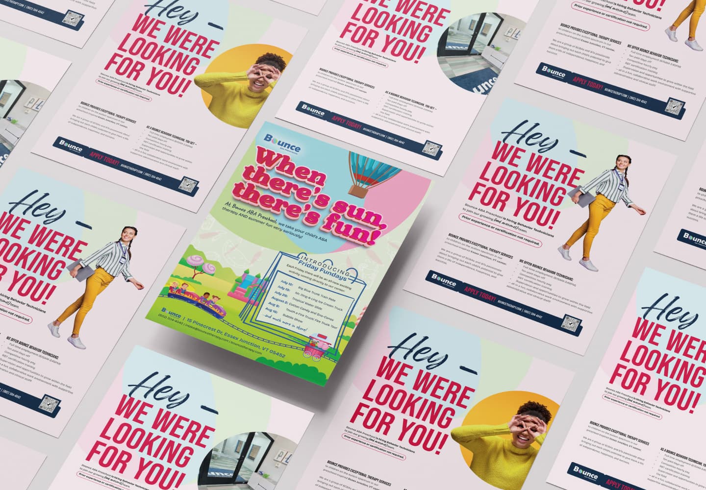
An established provider whose old site didn’t show it. We softened their existing brand into something likeable, credible and trustworthy.
Bounce is an established ABA provider with a genuinely distinctive model — 1:1 therapy woven into a real preschool day, backed by two decades of experience. The problem was simple: their old site didn’t show any of that. They already knew what they wanted, too — illustration combined with real children — they just needed it executed properly.
The strategic call was restraint rather than reinvention. We kept their existing logo and colors so they didn’t lose recognition, but lightened the palette to feel warmer and friendlier without giving up credibility. A hand-drawn heading font sits naturally beside the illustration style, and the ball from their logo becomes a recurring motif across the site. The outcome is a brand that finally looks as established as they actually are — and is very recognizable and likeable.