
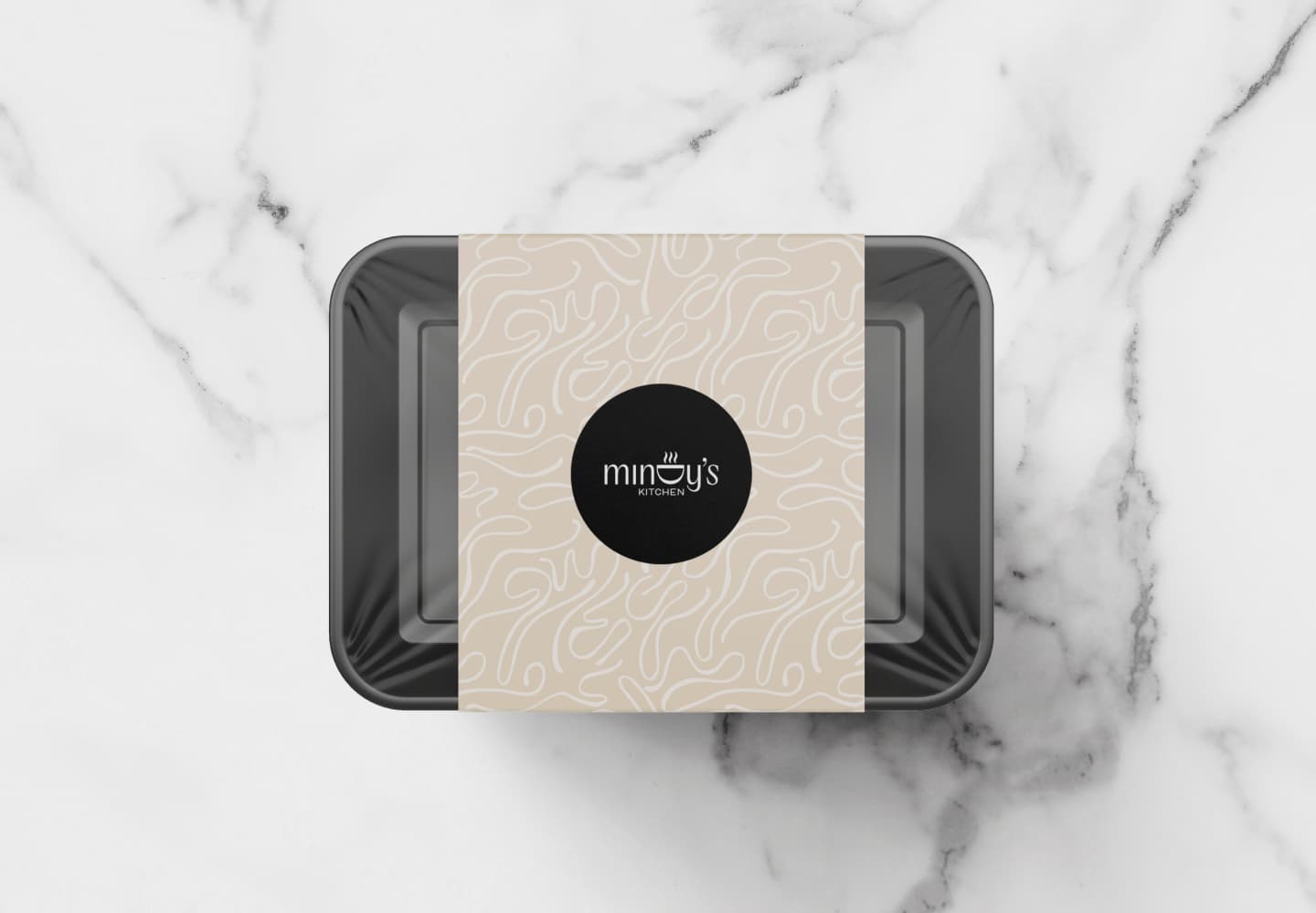
Mindy’s Kitchen
A home food business that needed to feel upscale and homey at once. We built the warmth right into the logo — a rotated 'd' becomes a pot, with steam rising off it — so the brand feels boutique without ever losing the heart.
Mindy's Kitchen delivers homemade, boutique-quality meals with a real hand-holding experience — fresh food, beautiful packaging, prompt delivery — mostly to well-off families, including many from abroad looking for that personal, homemade touch in Israel. The challenge was the balance: the brand had to feel upscale and boutique, but also warm and approachable, and because it was newer on the market, it had to earn trust and evoke a bit of nostalgia at the same time.
The strategic key was making warmth and elegance live in the same mark, rather than trading one for the other. The logo uses a modern, elegant font for the upscale feel, then hides the heart in a detail — a rotated 'd' that doubles as a pot, with steam rising off it, quietly signalling home-cooked comfort. Getting there meant steering the palette away from its first, too-feminine direction: we moved to black, maroon, beige and white, dropped the pink entirely, and cut anything that read as lower-end, landing on something that finally felt both boutique and genuinely warm. The result is a brand that looks elevated enough to justify the price, and homey enough to make you trust the food.