
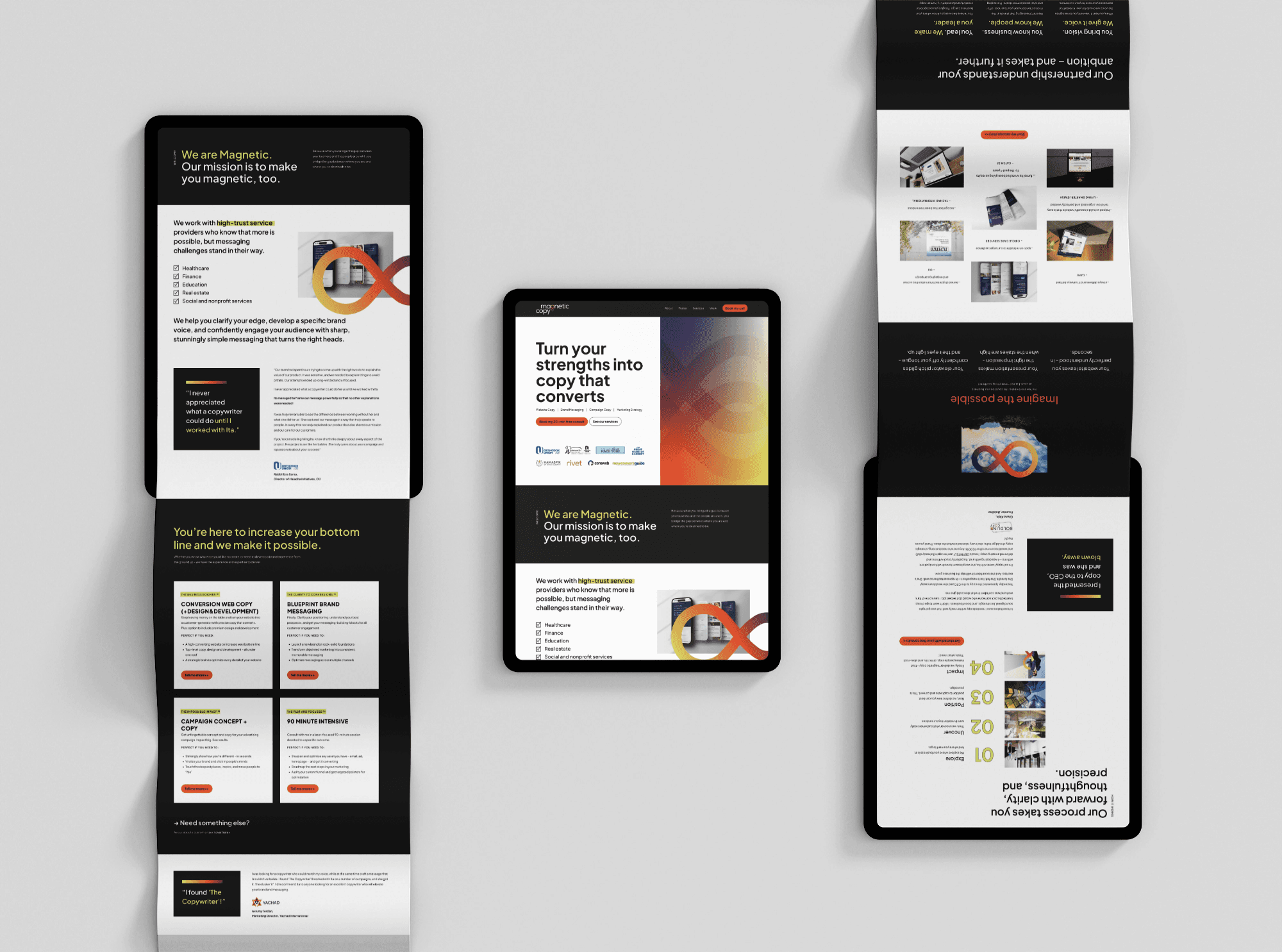
Magnetic
They go deeper than other copywriters — so we hid that promise right in the logo. An infinity sign built into the ‘g’: go deep, deliver, without saying a word.
Magnetic does high-end copywriting for people in healthcare, finance and real estate who know they’re capable of more and aren’t sounding like it yet. What actually sets them apart is depth — they dig further to find a client’s real voice than most copywriters bother to. The challenge was that “depth” is invisible. You can’t put it in a color. And the brand had to hold three things that usually fight each other: bold, ultraprofessional, and still friendly.
The strategic move was to make the logo carry the promise. The wordmark hides an infinity sign inside the ‘g’ — a quiet signal of how they work: go deep, deliver. Black and white keeps it serious, the lime green and burnt orange bring the boldness and energy, and a rounded typeface keeps the whole thing approachable instead of cold. The infinity sign and gradient repeat across the site, so the brand keeps saying “depth” everywhere you look — without ever having to spell it out.
“I was blown away by the branding she created for my company — it takes our position to a whole new level. If you’re considering hiring Deborah, know that she is fully invested in making your project a success. She is intuitive, patient, and exceedingly talented.””